[vc_row][vc_column][vc_column_text]
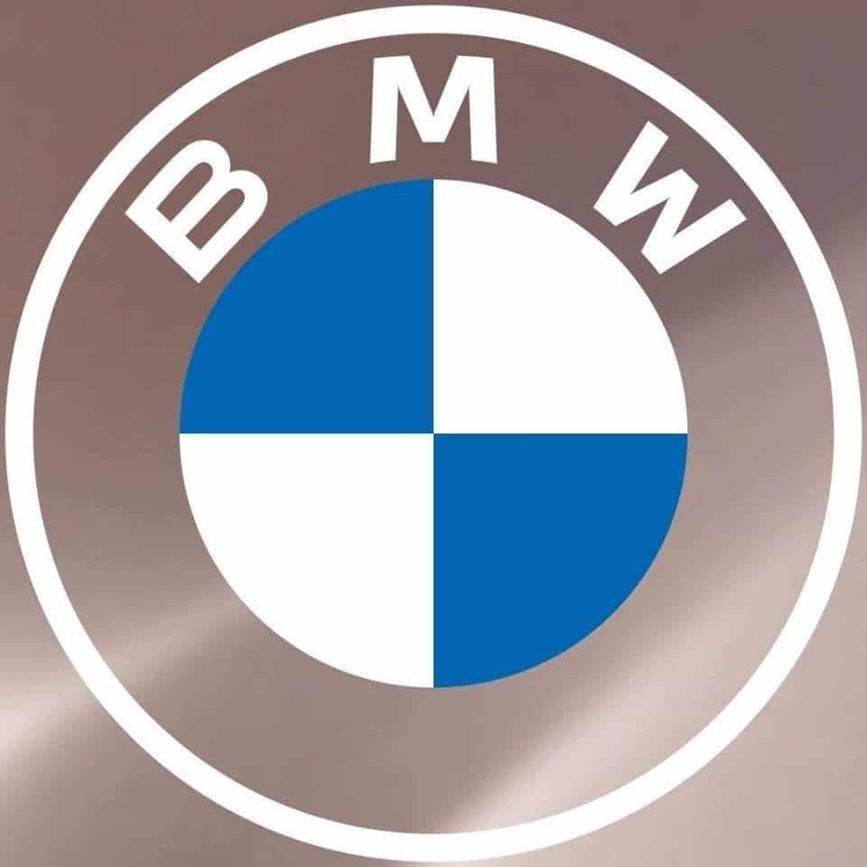
The famous German automaker unveils a new version of its iconic logo. A very first since 23 years.
This new version, the sixth since the birth of the brand in 1917, is much more sober and lighter. Make way for flat design: if the use of the blue and white chromatic mixture persists, the gray borders and the black ring are no longer part of the graphic charter.
Note that the visual had already left aside the color gold in favor of white in the early 1950s viagra generika schweiz rezeptfrei.
According to Jens Thiemer, head of the customer and brand department: “BMW is becoming a brand that creates relationships. The new communication logo conveys an idea of openness and clarity.”
The choice of this new look while transparency is also intended to be a bias serving to facilitate the affixing of the logo on certain specific supports. “The more discreet visuals and graphic flexibility allow us to adapt more easily to the wide variety of contact points that BMW will use in the future for its online and offline communication” said Jens Thiemer.
On the occasion of this renewal, the car manufacturer took the opportunity to develop a storytelling around the history of its logo. “Many people think that the BMW logo represents a stylized propeller, but the truth is different,” comments Fred Jakobs, director of archives for the BMW Group Classic.
However, this logo is not expected on the brand’s next cars, but next year it will be displayed on the new electric sedan called BMW i4.
Read also > BMW enters in the Marcolin group brand portfolio
Featured Photo : © BMW[/vc_column_text][/vc_column][/vc_row]

